Atrilyx Dashboard

A centralized platform that transforms complex ad performance metrics into clear, actionable insights
INTRODUCTION
Atrilyx is a web application that centralizes advertising data into a single, intuitive Adtech dashboard, solving the challenge of managing multiple platforms. It provides actionable insights and customizable visualizations, enabling smarter, faster decision-making for campaign success.
*This case study focuses specifically on the design of the reporting dashboard and insights experience. While onboarding and login flows were part of the broader project, they are not included in this breakdown to maintain a clear focus on core functionality and user impact

My role

Responsible for user research, conceptualization, information architecture, data visualization, UX/UI design, and delivery of key dashboard features.

Team

CIO

COO
Sr Software Developer

Front-end Developer
Back-End Developer
Designer (me)

Database Engineer
Systems Admin
Product Managers
Stakeholders

Tools

Figma
Adobe XD
Whimsical
UserTesting
Adobe Cloud
PowerBi
Google Analytics
Jira

Platform

Responsive Web-App

Timeline

2021 - 2024
View Atrilyx Project

The Problem

Marketing teams struggled to analyze campaign performance due to fragmented data across platforms. Users like media buyers, data analyst, social teams, sales, stakeholders and marketing leads had to manually compile reports, leading to delays, errors, and unclear insights.

Without a unified system, understanding ad effectiveness was time-consuming and inconsistent. A more intuitive solution was needed to centralize data, reduce reporting friction, and empower faster, smarter decisions.

🧠

The Challenge

We were tasked with designing a UX-friendly advertising dashboard  to unify ad data into one easy-to-use platform. The product had to serve both high-level decision-makers and detail-focused analysts.

Translating complex data into clear visual insights, balancing depth with usability, and supporting future scalability were key challenges. Working in agile sprints, we prioritized clarity, modularity, and user control throughout the process.

🎯

Product Goals

  • Unify data into one centralized dashboard for holistic campaign views
  • Simplify reporting with intuitive navigation and flexible filtering
  • Improve decision-making through customizable dashboards
  • Reduce manual work for marketers by streamlining workflows
  • Design for scale, with modular architecture to support future growth

Design Thinking Process

Using the design thinking process helps me stay focused on what really matters—solving the right problems for users while aligning with business goals. It keeps things grounded, flexible, and purpose-driven.
EMPATHIZE

Understanding the Users

🧪
User Research & Method
To better understand the needs, behaviors, and challenges of our users, we conducted interviews with a range of internal and external stakeholders who regularly interact with our reporting platform.
Qualitative Interviews with:
  • Stakeholders
  • Sales Team
  • Data Analysts
  • Social Media/Marketing Team
  • Clients
💡
Key Insights
Users needed a single source of truth to avoid switching between platforms.
Clients valued clear, tailored data visualizations that speak to their KPIs
The platform needed to support customizable reports and data breakdowns.
Teams wanted a simplified experience, especially when filtering or exporting data.
There was a strong need for scalable reporting with access to multiple report types.
Pain Points
Inconsistent Data Sources
Users struggled with scattered data and lacked a centralized platform for decision-making.
Poor Data Visualizations
Visuals were either too basic or too complex—users couldn’t get quick, actionable insights.
Limited Filtering & Customization
Users found it difficult to drill down into specific data sets or build personalized reports.
Friction in Navigation
The current interface was unintuitive, which slowed down workflows and increased errors.
EMPATHIZE

Bringing Personas to Life Through Real Journeys

To design a dashboard that actually makes sense for the people using it every day, I created detailed personas and mapped out their typical workflows.
DEFINE

Problem Statement

Stakeholders, data analysts, sales teams, and clients need a centralized, user-friendly dashboard that simplifies data interpretation and provides actionable insights because current workflows rely on fragmented platforms, inconsistent reporting formats, and unclear visualizations that slow down decision-making and reduce efficiency across teams.
PROBLEM BREAKDOWN
Fragmented Data Across Platforms

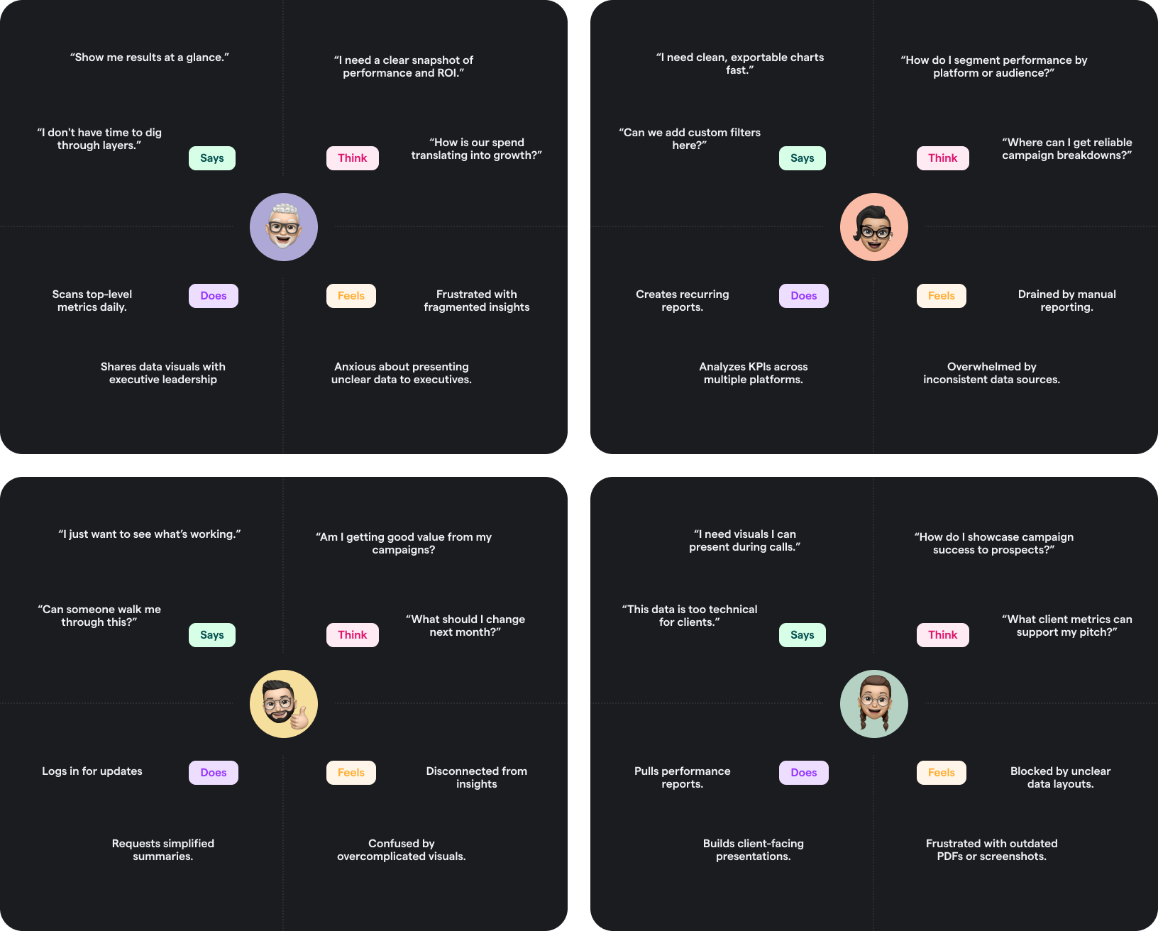
Teams pulled metrics from multiple sources, making it hard to align on insights. We needed one centralized dashboard to unify and validate campaign performance.

Weak Data Visualization & UI

Static tables and cluttered layouts made insights hard to digest. Users needed clean, intuitive visuals to quickly understand trends and take action.

Limited Functionality

The lack of filters, data breakdowns, and flexible views hindered both analysts and sales teams. More advanced and customizable features were essential.

Inefficient Collaboration

The platform didn’t support the needs of different user roles, forcing teams to use outside tools to share insights—slowing down decisions and clarity.

🧪
Hypothesis Statement
If we design a centralized, intuitive dashboard with clear data visualizations and customizable reporting features, then stakeholders, analysts, and clients will be able to access actionable insights more efficiently, improving collaboration, speed of decision-making, and overall campaign performance.
🎯
Goal Statement
Our Atrilyx dashboard will let users easily access, customize, and visualize advertising performance data, which will affect internal stakeholders, data analysts, sales teams, and clients by providing a single, intuitive platform for insight-driven decision-making, faster reporting, and greater alignment across teams. We will measure effectiveness by increased user engagement, reduced reporting time, higher client satisfaction, and improved campaign outcomes.
DEFINE

Structuring the Experience for Clarity and Usability

Understanding Structure to Support Usability

With clearer user needs and a sharper view of our product goals, I began mapping out the overall structure of the platform. This step helped define a direction for how content and features could be organized to support usability and scalability. While still open to iteration, this early IA and sitemap gave the team a shared vision to build upon moving forward.

I focused on organizing information based on how users from CMOs to data analysts would access reports and insights. Each section was designed to reflect user intent, whether they were looking for high-level summaries, detailed attribution, keyword performance, or custom dashboards.By outlining the hierarchy and flow of the application, I was able to align functionality with the needs of multiple stakeholders.

💡 Key Insights
  • Prioritization Based on User Roles: Executives need high-level summaries, while analysts and marketers need quick access to granular attribution and keyword data. This informed the grouping of pages
  • Clear Separation of Report Types: Organizing reports into Attribution, Keywords, and Custom Dashboards helped eliminate redundancy and kept navigation focused.
  • Scalability Matters: The structure I built allows room for future features, including more advanced reporting tools, without disrupting the current hierarchy.
  • User Flow Simplicity: Minimizing nesting and using flat navigation for frequently accessed areas ensures users can get to their insights with fewer clicks.
IDEATE

Competitive Analysis

Why I Did It
To understand what other advertising analytics platforms were doing well and where they fell short I conducted a competitive analysis. This gave me a clearer sense of usability standards, data visualization techniques, and user expectations. It also helped identify whitespace opportunities where Atrilyx could stand out.
💡 Key Insights
  • Most platforms are either too technical or too limited for a cross-functional team.
  • Users often struggle with platform fragmentation switching between tools to get the full picture.
  • There’s a need for centralized insights, flexible data visualizations, and simplified UX for different user roles.
IDEATE

Rapid Sketching

After brainstorming with HMW questions to reframe some additional ideas, I decided to put them into exercises by doing rapid sketches.

🖊️ Key Layout Ideas Explored:
  • A clean hero widget layout with key KPIs front and center
  • Modular card systems with drag-and-drop rearrangement
  • A tabbed navigation layout to support multiple reporting views
  • Sidebar vs. top-nav configurations for improved scannability
🧩 Takeaways

Sketching without constraints helped surface ideas I wouldn’t have arrived at through wireframing alone. I began to see opportunities to:

  • Mix visual storytelling with raw data
  • Balance detail with digestibility
  • Give users control over what and how they see data
DESIGN

Visualizing the Path to Clarity

To ensure the experience aligned with how user's will naturally navigate and interact with Atrilyx, I mapped out a user flow based on their key goals. This helped me define the core screens and decision points that shaped the foundation of the platform's interface
DESIGN

Sketch, Test, Repeat.

Starting with paper wireframes, I explored multiple layout variations to prioritize content hierarchy, data visibility, and intuitive navigation. These early concepts allowed for rapid experimentation. From there, I translated the strongest ideas into low-fidelity wireframes to refine structure, screen flow, and interaction patterns.

After developing paper & low-fidelity wireframes, I conducted early usability testing to gather actionable feedback from stakeholders and potential users. This helped validate core flows and surface areas for improvement before committing to high-fidelity visuals.

🎯
Goals
To evaluate the effectiveness of the dashboard's layout and functionality in supporting the main users needs for quick data access, intuitive navigation, and efficient account management.
Validate if users can navigate the dashboard intuitively.
Understand if users can interpret the modular data visualizations.
Test the clarity of the user flow and navigation elements.
🧪
Method
  • Format: Remote moderated
  • Tool used: Figma prototype + Zoom
  • Participants: 4 internal stakeholders, 2 analysts
  • Session length: 20–30 mins each
Tasks:
  • Navigate to the main dashboard
  • Access and interpret various reports
  • Utilize data visualizations and filters
  • Left Navigation exploration
💬  
Key Findings
Pros
Users found the expandable side nav intuitive, valued the customizable modular layout, and appreciated the quick access to help for a smoother, more confident experience.
Cons
Some users found certain interactions underdeveloped, making it hard to evaluate their usefulness. Filters and data grouping features were also flagged as unclear creating friction in analyzing the dashboard efficiently.
Iterations
Based on the feedback, I prioritized refining key interactions, navigation, data visualization and filtering.
DESIGN

Refining Wireframes

Building on the insights gathered from paper & low fidelity wireframes and usability feedback.

We tested our mid-fidelity wireframes with five users to evaluate clarity and usability. 80% completed key tasks, but feedback pointed to areas for improvement. Users liked the expandable navigation and clean layout, but wanted clearer chart visuals, more meaningful iconography, and enhanced filter controls. These insights led to an additional iteration at the mid-fidelity stage to refine data presentation and improve overall usability before advancing to high-fidelity designs.
DESIGN

Establishing the Design Language

To keep things cohesive across the platform, I built a flexible design system from the ground up. This UI kit helped define the visual language for Atrilyx. Covering everything from brand colors and typography to components like filters, charts, and buttons. It served as the foundation for building scalable, user-friendly interfaces.
DESIGN

Building the Components

With the design foundation in place, I started creating key components like cards, charts, and data visualizations. Each one was built to stay consistent with the system while being flexible enough for different reporting needs.

💡 Key Insights
  • Data-first UI: Components were built to handle real-world data without clutter or confusion.
  • Modular and reusable: Designed with a system-first mindset to speed up dev handoff and future updates.
  • Chart flexibility: Bar charts, pie graphs, line charts, and stacked visuals were all optimized for clarity at a glance
  • Visual hierarchy: Each card or component clearly separates value, context, and interaction for a clean, scannable layout.
components
DESIGN

Bringing It All to Life

With clear direction and refined components in place, I translated the mid-fidelity work into high-fidelity wireframes.
Designed to meet users' needs for better data visualization and flexible, modular reporting for easier insights.
Making it easier for users to jump between reports with a clean, expandable side nav.
Because not everyone views data the same, global filters, advanced filtering, and grouping let users shape insights to fit their needs.
Giving users the power to build their own custom dashboard to fit their unique workflows.
PROTOTYPE & TESTING

From Insight to Interface
The Prototype in Action

After rounds of exploration, testing, and iteration, this high-fidelity prototype brings all the pieces together. Every element was shaped by user feedback, usability insights, and design collaboration to deliver a reporting experience that’s flexible, clear, and built for real-world needs.
🎯
Impact
  • The redesigned dashboard led to a 47% increase in daily active users and a 62% decrease in time spent accessing key reports.
  • The improved clarity and customization capabilities helped the sales team showcase the platform more effectively, contributing to new business opportunities and growth.
  • It played a key role in improving client retention by making data more actionable and digestible, leading to stronger relationships with existing clients.
🧠
What I Learned
  • Designing a modular, data-heavy dashboard requires more than aesthetics it’s about clarity, usability, and empowering users to find insights faster.
  • Collaborating closely with engineers, analysts, and stakeholders helped align user needs with business goals, which made the design decisions more impactful.
  • This project deepened my skills in usability testing and iterative design, and reinforced the importance of listening not just to feedback, but to the context behind it.
🚀 
Next Steps
  • Integrate AI Capabilities: Explore implementing AI-driven insights to provide users with predictive analytics and personalized recommendations.
  • Enhance New Features: Implement features that improve accessibility, add feature to help users to have more control to related trends such as sharing & collaborating, and more.
  • Continuous Iteration: Establish a feedback loop for ongoing improvements, ensuring the dashboard evolves with user needs.
Emoji

Got Big Ideas,
Let’s Make Them Happen!

Let's
Talk